Buraz sandwich shop
·
Buraz sandwich shop ·
Client: Buraz (local fast-food restaurant)
Role: Product designer, Brand designer
Duration: 6 weeks
Deliverables: Mobile app UX and UI, brand direction and style guide, clickable prototype, and early responsive website direction.

Introduction
About
Buraz is a local fast food restaurant focused on high quality food with a homemade touch.
The project started from an operational need to improve how customers order for delivery and to expand reach beyond walk-ins.
Goal
Create a fast, clear ordering experience for people who do not have time to cook.
Support business growth by making it easier for new customers to discover the menu and place an order with confidence.
Problem
Food ordering apps often fail when users cannot place an order quickly, get overwhelmed by messages, or do not trust delivery timing.
Early research pointed to recurring pain points: ease of use, delivery time expectations, too many messages, and time to complete an order.
My role and responsibilities
I led product design for the mobile app from discovery through prototyping and iteration, and I owned the brand and visual direction.
I was responsible for research synthesis, user journeys, information architecture, interaction design, UI design, and accessibility considerations.
Discovery and research
I started with a competitive audit to understand common patterns in food ordering apps and where they break down.
To ground decisions in real behavior, I ran a survey with people who already order food using mobile apps and synthesized needs and pain points into design priorities.
What users expected
Users repeatedly asked for search and filters, the ability to repeat previous orders, calorie information, clear dish photos, and a clear checkout flow.
These expectations set the baseline for the first version of the app and shaped the visual hierarchy across the ordering flow.
User personas
I translated research themes into personas to keep decisions tied to user motivations and constraints.
User flow
I mapped the core journey and created a primary user flow for ordering a sandwich to reduce friction between browsing, customization, and checkout.
Wireframes
I used hand drawn and digital wireframes to validate structure before moving into high fidelity UI.
The focus was information hierarchy and speed in key moments like item customization, cart review, and order confirmation.
Usability testing on an early prototype
I ran an unmoderated remote usability study on an early prototype to validate whether users could complete the two critical tasks: ordering and customizing an order.
Study Details
Research questions
Do users find the app easy to use?
How long does it take for a user to order a sandwich from our app?
Are there any parts of the app the user doesn’t know how to use?
Should some features be implemented differently?
Participants
5 participants.
3 males and 2 females between the ages of 20 and 50.
Research insights
Editing ingredients
Users need more intuitive way to customize the ingredients of a sandwich
Solution
Based on findings, I redesigned how users add sides and drinks, improved ingredient editing, and reworked the custom instructions field so users can personalize orders with less friction.
Key design decisions
I designed checkout as a clear, guided flow because clarity and pace matter more than dense screens in an ordering context.
I treated customization as a first class experience since it is central to food ordering and a common source of errors when it is unclear.
Adding sides, drinks & sauces
Users need a faster way to add additional items to the order
Methodology
5-10 minutes per participant.
Remote, unmoderated usability study.
Users were given tasks to perform on a live low fidelity prototype.
Specific instructions for the cooks
Some users explained they would like the option to write specific instructions on how they would like their sandwich to be made. Example: To meat be well done
Visual system and brand
Red is the primary brand color and I used it consistently for key actions and interactive elements.
I balanced it with white and neutral grays for readability, and selected Poppins for a clean, flexible typographic system across screens.
Accessibility & inclusion
I used sufficiently contrasting colors, large tap targets, and clear iconography to support readability and touch interaction.
I also aimed for descriptive image text and clear hierarchy to better support screen reader usage.
Finalized design
Finalized design
The final UI covers the critical ordering path: welcome, login and sign up, homepage, product details, cart, and confirmation.
I created a clickable prototype to validate the full flow and document interaction intent for handoff
-
![]()
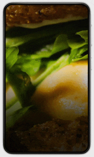
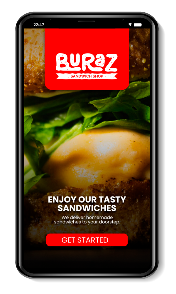
Welcome screen
-
![]()
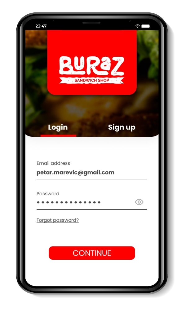
Login/Sign up screen
-
![]()
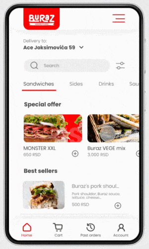
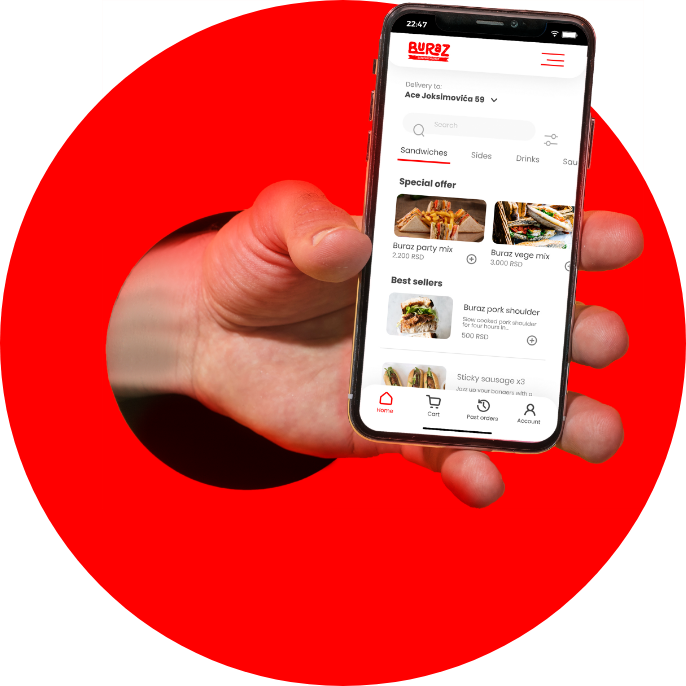
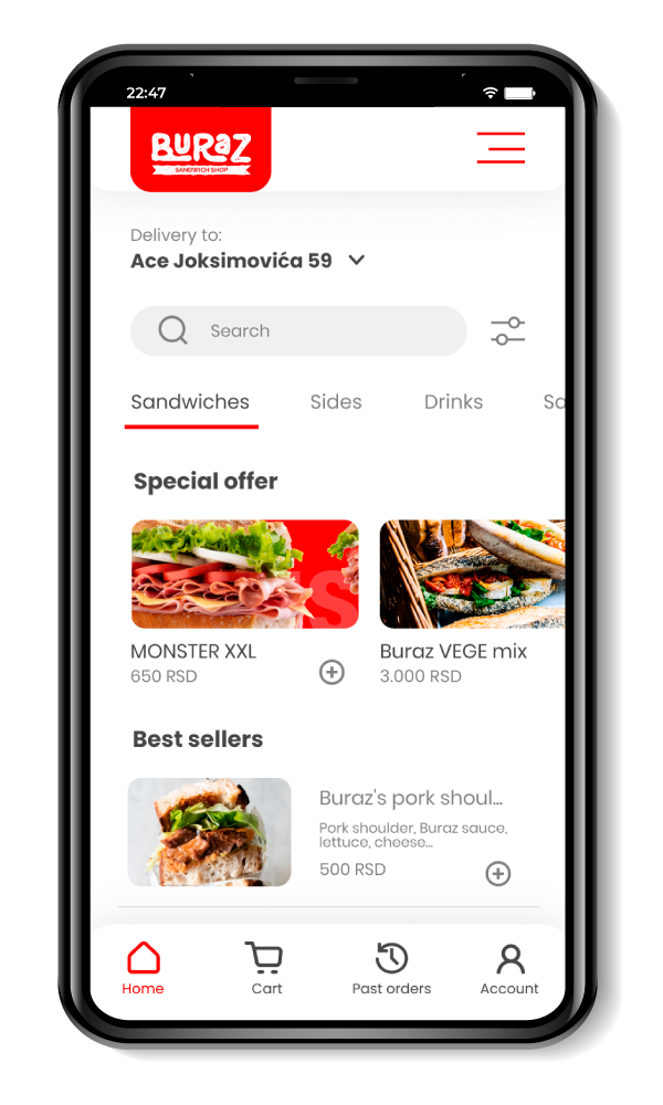
Homepage screen
-
![]()
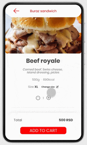
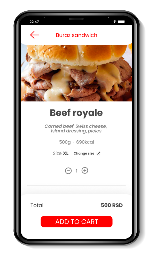
Product single screen
-
![]()
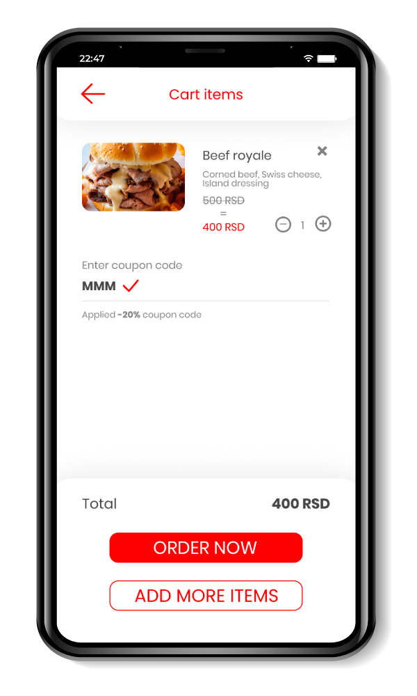
Cart screen
-
![]()
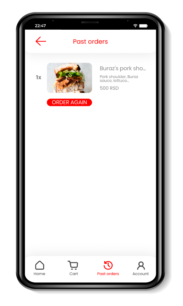
Past orders screen
-
![]()
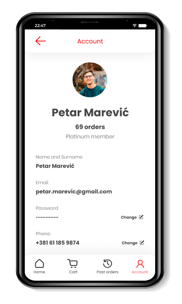
Account screen
-
![]()
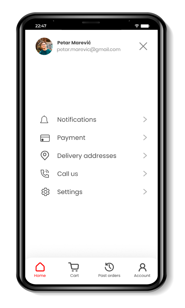
Burger menu screen
-
![]()
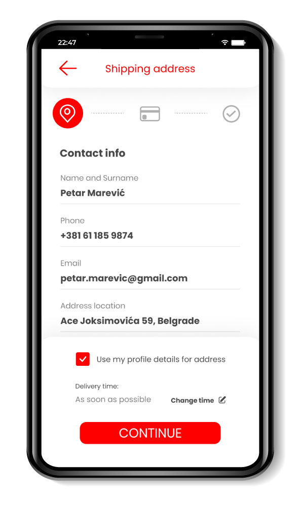
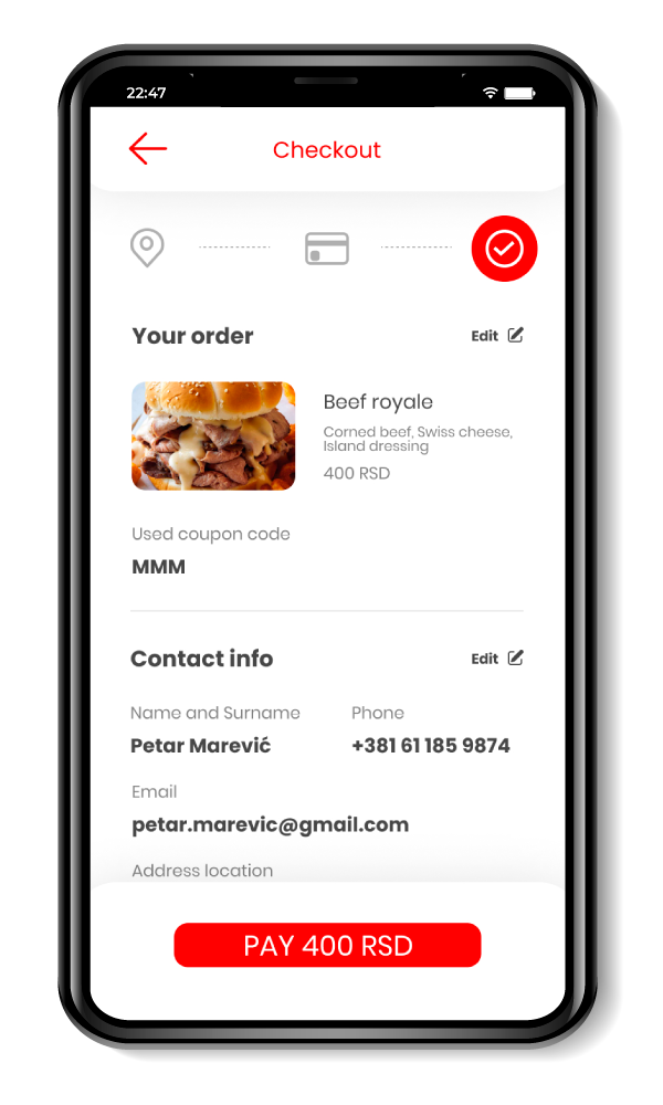
Checkout screen 1
-
![]()
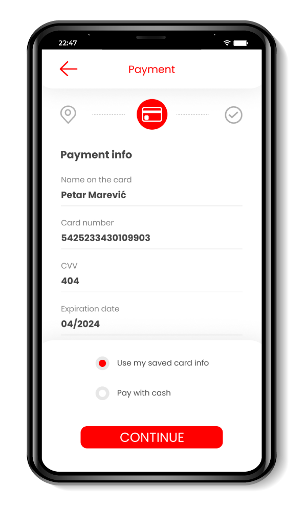
Checkout screen 2
-
![]()
Checkout screen 3
-
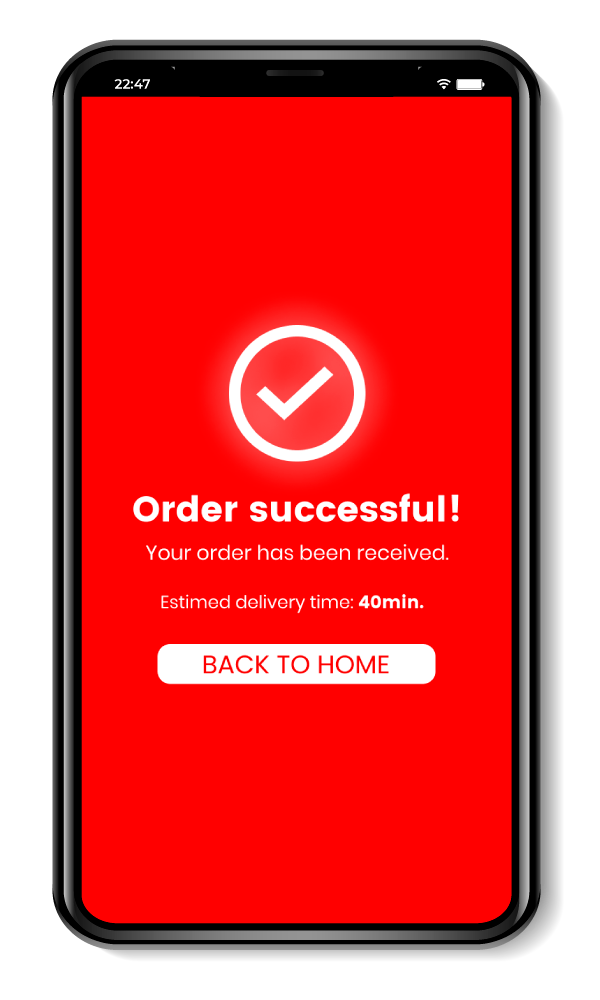
![]()
Confirmation screen
Prototype
Responsive website direction
In parallel, I started a responsive website direction so users can order from a browser without installing the app.
This supports the same expansion goal while serving users who prefer not to download new apps.
Next steps
Next steps include another round of usability testing and finishing the remaining supporting screens to prepare for development.
I would also define success metrics for the first release, such as checkout completion rate, time to place an order, and repeat order rate.